Module 3 Extra Credit Posts for Fall 2025
October 27
I was hugely amused by this editorial entitled "Getting Used to 3% Inflation" from The Wall Street Journal. I didn't see it until this weekend (and it may have actually been published before class on Friday). But it says essentially the same things that I did about Friday's inflation numbers.
Is “three” the new “two?” ... No one in Washington seems bothered that this remains well above the Federal Reserve’s 2% inflation target.
... The White House press office hailed this as an anti-inflation triumph.
There’s always some excuse or explanation that politicians and Wall Street offer to say this is no big deal. ... But at some point you have to admit all these add up to a persistent inflation problem. ...
... It’s obvious now that Chairman Jerome Powell’s declaration of mission-accomplished in September 2024 was premature when he began the Fed’s interest-rate cuts this cycle. ...
... Yet the Fed seems poised for another 25-basis point cut in its target short-term interest rate when its Open Market Committee meets next week.
President Trump also bears some responsibility. ... his tariffs are contributing to higher prices in many goods.
...
Meanwhile, for all the controversy over Mr. Trump’s attempts to meddle with the Fed, he and Mr. Powell both seem to want lower interest rates. It makes us wonder if 3% is Washington’s new de facto inflation target. We doubt this is what anyone voted for in 2024.
If you want to read the whole thing, you all have free access to The Wall Street Journal through the School of Business.
October 24
New inflation data came out this morning. This report was delayed several days due to the government shutdown.
The inflation rate for the consumer price index is 3.0% over the last year. Here's a chart of the last 10 years of data:

I have seen this interpreted as both a good number (low enough) and a bad number (still too high), depending on the underlying politics of the source. For example, the White House will claim that this rate is low enough to justify further interest rate cuts by the Federal Reserve: they are more worried about the expansionary effect of lowering interest rates than the side-effect of more inflation.
To a student, this must seem crazy. But you can check yourself. Try the keywords "inflation rate hot" in Google, and you'll get hits indicating that 3% is high. But if you use the keywords "inflation rate cool", you'll get hits indicating that 3% is low. This isn't normal. To put a good spin on it, it does reflect that policymakers are kind of split around 3%. But really, it mostly reflects that the internet has become a place where people just say whatever they feel like. That's not good for students.
My professional (and hopefully more politically neutral) view is that we should be noticing that inflation has yet to return to the rates we saw in 2020 and earlier. This worries me. Governments all over the world typically claim victory over inflation prematurely, and then it pipes again (rather like a bacterial infection when the patient stops taking the antibiotics early).
October 22
Here's more on creative destruction and living standards.
This is from Marginal Revolution (the most popular economics blog in the world, and still free!).
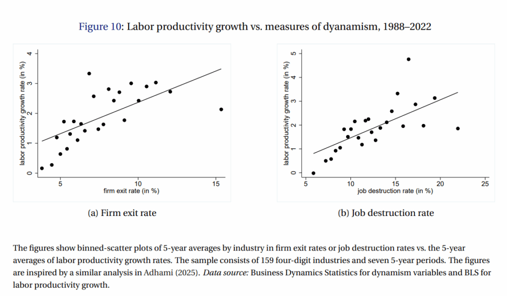
The horizontal axis in both cases is things people don't like as individuals: on the left is firm exit rate (through bankruptcy or voluntarily closing), and on the right is the job destruction rate (the firm stays open.
The vertical axis is the same for both, and shows something that owners and managers of firms like. This is the growth rate of labor productivity: how fast is the value that workers produce going up.
Workers don't really like or dislike labor productivity. It's a variable that measures an intermediate step.
What workers care a lot about is real GDP per capita, which is our best measure of how much stuff we have, but also all the intangible things that go along with that stuff (like better healthcare, more education, and so on. Here's a chart of that across countries from Our World In Data:

What Aghion and Howitt shared the Nobel Prize for was showing how the destruction of peoples' jobs and firms with lower productivity by those with higher productivity led to improvements in well-being for everyone. Mokyr shared the prize for showing how this chain became more common in the 17th and 18th centuries, helping to explain the kink in the hockey stick diagram from the 1st week of class.
October 20
The Nobel Prize for economics was awarded last Monday (a holiday, and then Wednesday was an exam, and Friday ... not sure why I didn't post about this on Friday).
The prize this year was all about the stuff in Chapter 9 in your text.
Nobel Prizes are awarded for work all over economics: sometimes for micro, sometimes for macro. Macro has been on a tear, winning arguably the last five times.
Nobel Prizes are often given to more than one person, who did related work. And sometimes those are teams. This year, they gave half the prize to one person, and a two person team split the other half.
The winners are usually academic economists: professors you might have if you transferred to the right school.
They gave half to Joel Mokyr. He does historical economics: trying to figure out what was happening when people didn't yet know it was happening. He's been working since the 70s on trying to figure out what was special about that period in the 17th and 18th centuries when growth took off in some locations. It could have happened anywhere, anytime. But why in those places at that time?
They gave the other half to Phillipe Aghion and Peter Howitt, for work they started in the early 90s. These two work in theory. They solidified an idea that went back to an economist named Schumpeter writing in the second quarter of the 20th century. He noted that what rich regions seem to do is create new and better things by destroying the old ones, and poorer regions seem to hang on to those older ways of doing things. Aghion and Howitt explained in detail how that would work, and what data you could actually test it with.
ChatGPT or any other AI can tell you a lot about these contributions.
October 17
There is a lot of casual talk about recessions, and the U.S. being in a recession, or going into a recession.
First off, a lot of this is nonsense. And it tends to be nonsense whether or not the economy is in bad shape or not. Some people just say this stuff to get clicks.
Secondly, a lot of people simply don't know. But they may just say "the economy is in recession" or "we're going into recession". There's nothing wrong with having opinions and voicing them.
Third, saying negative, pessimistic, things is just something people do. Bad news sells. Bad gossip gets a listen. Here's a link to polling information showing that for pretty much all of your lifetime people have been saying the economy isn't very good. You know what? If something goes on for 20 years, it's normal, not bad.
Having said all of those, remember what you've learned about recessions: only about 1/4 of quarters are recessions, and those tend to clump together. For example, in some 5 year period, there might be one recession of roughly 5 quarters in length, anywhere in that period. That's not a lot.
Another problem is that recessions start moderately. Remember the lecture where I said the economy is like a jagged saw? You could add that peaks are not very peaked at all. They're more like the smooth curve over the top of the roller coaster. This means that recessions have often started before we're really even sure we can feel them.
***
So here's one blogger at Political Calculations who charts out a well-know recession probability index. It's been improving for over 2 years. And the last time it signaled recession, in 2023, we didn't actually get the sustained bad period that makes a recession. When doctors do tests on patients, they call this sort of thing a false positive. They're very common with the economy.
Here's another one from VettaFi. They focus on what they call the big 4 recession indicators. Generally you need all 4 of them showing declines (reddish pink in their tables) most months for several months in a row to have a recession. They were all green last month.

Comments
Post a Comment