Module 1 Extra Credit Posts for Spring 2024
For January 31st
This post, and all others back to the start of the semester are the ones I may ask short answer extra credit questions about on Exam 1.
***
On Wednesday we just looked at some random news links about the FOMC's monetary policy decision (this was one, and here is another). Keep in mind that those articles were being updated in real time, so they may look a little different with the passage of time.
As expected, they kept their target interest rate in the same range.
They announce this at a press conference with a Q&A afterwards. Here's a video, and here's a transcript of the official statement. (Note that the video is one of those live event thingies where they just put the camera on and let it run ... so it's almost 2 hours long, but the speaker (Chairperson Jerome Powell) doesn't even come out until about the 59 minute mark). Those statements are super carefully worded because a lot of money is riding on potential interest rate changes; interestingly, the financial blog ZeroHedge put the statement into Word and used it's review features to note the words that were edited from the last statement in December. Financial professionals trade billions based on those edits.
This is not a great chart:

This is from the coverage in The New York Times, entitled "The Fed Holds Interest Rates Steady and Is Not Quite Ready to Cut Them". They don't play nice ... like a professor is going to steal their graph and sell it for megabucks. ;-)
Anyway, the horizontal axis is in years, with the tick marks every five. The vertical axis is interest rates. The blue shading is recessions. And the brown-ish shows the history of the Fed's interest rate target.
I put that up here to start to expose you to some regularities. First, note there are evenly spaced steps in some spots: these are them changing the target at one meeting and holding it constant until the next one. Also note that those steps are more obvious on the right half of the chart: this covers the last 30 years or so, and a period in which the FOMC has tried to be more predictable in its actions.
Generally speaking they drop interest rates when the economy is weak, and you can see this around the blue shading. In tandem, they had usually driven interest rates up in the period before that.
There's also a pattern here that I call "baby steps". Often what they do is move interest rates consistently in one direction in a sequence of small steps. Then they hold it steady for a while. Then they move back the other way in baby steps. Part of what is attracting attention to the Fed this semester is that we are in one of those steady flat spots. From here, they will almost certainly move interest rates downward again, and once they start, they won't stop for a while.
So the big question over the last few months has been whether or not they will start the downward movement at the next meeting. Well ... not this one. And the point of parsing that statement linked above is to glean out a signal that they seem to be thinking that they won't do it at the next meeting in March either.
For January 29th
Hopefully, you're starting to get the impression that expectations of the future are an important part of macroeconomics.
Participants in the economy form expectations of what data announcements are going to look like. When those expectations are correct, not much happens. When they're incorrect, those people adjust their behavior as needed.
One of the big things people form expectations about is what the Federal Reserve is going to do with its interest rate target (this is a big signal about monetary policy).
Those decisions are made by something called the FOMC. They meet every 6 weeks on a Tuesday, and Wednesday morning. Then they announce their policy decision after lunch.
Their meeting starts tomorrow, and by class time on Wednesday we'll be able to find out what they did.
The expectation is that they will not change their interest rate target (but maybe at the next two). We'll see.
For January 26th
The announcement for real GDP growth rate came out yesterday morning at 6:30.
This is their rough draft, called the "Advance Estimate".
It came in at 3.3% SAAR for 2023 IV.
Here's the press release. Note that the graph makes last quarter look small because they are still including the two ridiculous looking CoVid quarters from 2020 — those are unlikely to ever be repeated.
This announced rate is huge. Ridiculously huge. So huge we can be almost sure of a big downward revision. The expectations that I posted the other day were 1.3%, 1.8%, and 2.3%. Those are usually pretty accurate, and I'd guesstimate that anything more than a few tenths higher than those would be really unusual.
Do note that if this number holds up, it's great news. But I'd be a lot more confident of that if those three expectations had all been like 1% higher than they were.
For January 24th
I promise I'm trying to come up with lighter and easier ones (I don't like writing stuff this long any more than you like reading it).
This map isn't based on data that you'll learn about in the textbook. But it does illustrate some general points. Do note that it's from last August, and while the situation won't change too quickly, no doubt it has changed somewhat.
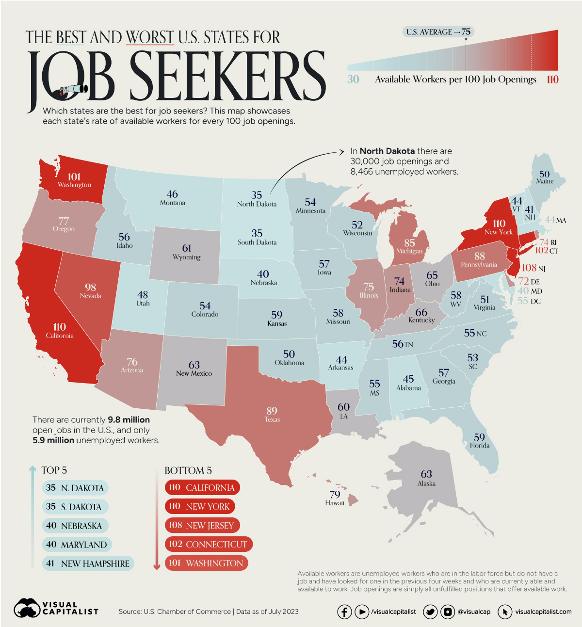
One thing readily shown here is that the state of the labor market is not even across the whole country.
Another thing that can be inferred is that current perceptions often lag behind reality: once you here that you should move to a place because there's more jobs, it's probably already too late because other people did it first. It seems like everyone's moving to Texas, but the reddish color suggests they probably already have. And how many people do you know who think Washington or Nevada is a great place to move for a job? I think that ship sailed.
I'm also speculating here, but it seems to me that most of the kids I know who did summer sales or installations last year ... got sent to bluer states.
N.B. The coloring of this map is unrelated to the political labeling of states as red (predominantly Republican) or blue (predominantly Democratic).
For January 22nd
The most important piece of data we use in macroeconomics is called the real gross domestic product growth rate (real GDP growth rate, or just growth rate).
We introduce this in Chapter 7 (end of this week, or start of the next). That coincides with an announcement of new data.
It's sufficiently important that lots of forecasters try to provide an early feel for what the number is going to be. Calculated Risk posted estimates from 3 of those sources for what next week's number is going to be: 1.3%, 1.8%, and 2.4% per year. Next week, everyone will be assessing the announced number and comparing it to those expectations.
***
Those numbers are for the last quarter of 2023.
When that quarter ends, they collect all the data from the whole country, and put together their first estimate at the end of the next month.
They do this like how you're "supposed" to write term papers: with a draft, a revision, and a final version. Those come 1, 2, and 3, months after the quarter ends, and then they start on the next quarter's data.
The post says the data is SAAR. That means two things: SA and AR.
SA means seasonally adjusted. GDP in the U.S. is always seasonally adjusted. There are regular swings in when people work more and work less, and they're trying to smooth those out (so people don't panic when the numbers bad every time January and February roll around).
AR means annualized rate. The growth rate changes from quarter to quarter. It's always expressed as if the rate for those 3 months persisted for all 12. So, really, the economy probably grew about 0.5% in that quarter, but you scale it up over a year, and you get something around the 2% they announced.
***
Real GDP growth rates are related to whether or not we feel good about the economy. Better then 2%, and we feel pretty good about the economy. Between 0 and 2%, the economy is doing OK, but it doesn't feel great. When growth is negative, it feels pretty bad.
***
Growth of real GDP is absolutely essential. Our population is growing 1.5 to 2.0% per year (that number is not solid due to inability to count immigration that's illegal). Beating that means more stuff (like food, shelter, healthcare, education and so on) for everyone. Falling short means we have to play catch up in the following quarters.
In assessing what makes countries richer or poorer, the richer ones have been able to consistently grow faster than their population growth rate, while the poorer ones have not.
For January 19th
I guess it's fashionable this year to dis Davos.
Yesterday's post quoted from a fairly conservative source (the opinion page of the Wall Street Journal). But here's another piece entitled "Why the Davos Smart Set Sounds Dumb" on the solidly Democratic site Politico.
It is not that the observations and arguments are notably dumb, though it is rare to hear something arrestingly smart. The signature of most conversations about current events is how emphatically commonplace they are. ... Outsiders, however, should liberate themselves from the illusion that these insiders really know the score.
...
There’s no reason to pick on Davos. It is just an especially concentrated setting ...
...
The youthful tendency is to believe these people have access to hidden pathways of information and world-shaping insight.
...
One can look at the phenomenon ... from different angles. The first ... many conversations about the news revolve around inherently imponderable subjects ...
...
The second way to think about it is that insights ... have been radically democratized over recent generations. ... weakened by cable news and demolished by social media.
...
The final point is that even the most highly credentialed people can be vexed by modern life — even in their own areas of expertise.
That may be the real lesson of Davos: Everyone is winging it, experts and schlubs alike, muddling through with at best fragmentary understandings of a fast-moving world and its inscrutable future.
Again, I emphasize that the problem is not that experts don't know what they're doing: the world is a hard place to figure out.
Rather, it's our belief that they do know what they're doing, and their cheerleading for themselves that encourages our belief.
The message here is that if macroeconomics ends up piquing your interest, read more textbooks, and listen less to people in positions of power (who may have taken less classes on this than you have).
The World Economic Forum is in the news this week. They are meeting in a resort town in Switzerland named Davos. (If you're curious, here's a link to a Google search results page with 195,000 news items about this meeting).
This event gets way more attention in the news than it deserves.
The event attracts leaders of country's governments and their attendants, leaders and attendants of NGO's, and celebrities.†
Perhaps I'm cynical, but I think part of the reason this event gets so much attention in the media is that most journalists are ... brown-nosers, bootlickers, sycophants, flunkies, fawners, or whatever term you like best. Importantly, acting this way definitely helps them get stories, so it's not like it's always a negative personality quirk.
Anyway, the attendees at the World Economic Forum (which is rarely abbreviated to WEF, go figure) have some power or influence. But collectively, the group itself has nothing except a claim on a high moral position.
Here's the problem: the World Economic Forum is moribund and doesn't know it. For a scathing viewpoint on this, see "The Humiliation of Davos Man" by Walter Russell Mead.
On both the far left and the far right, conspiracy theorists see the WEF and its allies as an all-powerful network successfully imposing a nefarious agenda on the rest of the world. This reading gets Davos exactly wrong.
The real scandal of Davos isn’t that it’s taking over the world. It’s that it’s failing. The Davos agenda—a global security order, an integrated world economy and progress toward objectives including decarbonization, gender equality and the abolition of dire poverty—is controversial in some quarters and on some points but is neither secret nor particularly nefarious. But far from imposing this agenda on a captive world, the Davos elites are wringing their hands as the dream slowly dies..
† It's a good time in your college career to learn what an NGO is. It stands for Non Governmental Organization. There are thousands of these. Some examples might be the Red Cross, the United Nations, the International Monetary Fund, the Sierra Club, PETA, and so on.
For January 12th
Get used to following a link to a blog called Calculated Risk. It's free, the author covers releases of new macroeconomic data, and he also produces some really good charts that you can't find elsewhere.
Here is the link for today's class.
***
First let me give you some background.
Inflation, the irregular climb in the prices of just about everything, will be one of the big recurring topics throughout this semester.
Inflation was huge news 2 years ago in this class, big news a year ago, but it's fading a bit as an issue for this year. That's good news in the real world: no one likes it.
Prices of most stuff you're concerned about are measured by the CPI (Consumer Price Index). It's just a weighted average of stuff households buy. There are thousands of other price indexes, measuring other stuff that gets bought, just for the U.S.
Inflation is measured as the rate of change of a price index. We focus most on the inflation rate of the CPI in the U.S.
The CPI is measured by the BLS (Bureau of Labor Statistics, part of the federal government's Department of Labor). It comes out once a month, usually on the second Thursday of the month, on a pre-announced schedule. You can be pretty sure I'll be posting about it again in a month.
At that time, the new number for the CPI and its inflation rate tell us about how prices behaved in the previous month. They collect the raw numbers on prices at the end of the month, spend more than a week cleaning them up, and collapsing that down into one summary value.
***
The headline is "... CPI increased by 0.3% ...". That's the inflation rate over that month.
A lot of policymakers and the media focus on something called Core CPI, also mentioned in the headline. You'll sometimes here the accompanying phrase "excluding volatile food and energy prices". Personally, I hate that measure: food and energy are what most people pay attention to. But, they like this measure for a reason: frequent changes in grocery store and gas station prices make the CPI bounce around higher and lower than Core CPI. But to me ... the bouncing around is what bugs people ... so we ought to focus on it more. Whatever. Maybe that makes me a weird macroeconomist.
That inflation rate doesn't sound like much. Make sure you can work out this math: it means something that cost $1,000 at the end of November cost $1,003 at the end of December. The problem isn't the little bit each month, but rather that it doesn't stop coming.
So in the first paragraph it notes 3.4% over the past year: 12 months, each with a little more or a little less than that 0.3% per month. Now, if your rent last year was $1,000, and it got raised to $1,034 would you notice more? Probably so.
Everyone with a little money knows its value is declining with the passage of time. So they're also forming expectations of what inflation will be. So that comment down at the bottom that the inflation rate was "slightly above expectations" is also important. "Slightly above" can be come a lot above if it keeps up for a couple of years.
Make sure you think about looking back at this post when the new inflation numbers come out in February, March, and April: there won't be as much explanation of these details then.
For January 10th
I will often post about linked articles from the Wall Street Journal. You have complementary access to this through SUU's School of Business. The article for today is entitled "Nation’s Top Economists Are Short-Term Happy, Long-Term Glum". This would be a good time to follow the directions in Module 0 and make sure you get access.
There are two things to note.
First, the article is about the big, annual, national, convention for economists. These conventions are going to come up again during a lecture on Chapter 14 after spring break.
Secondly, you probably don't know much macroeconomics yet. But one of the things I try to do is introduce you to some of the data that's out there to help us assess happenings that are bigger than we are. This article includes a chart of the global supply chain pressure index. This measures what we all felt over the last few years: 1) was the stuff we wanted on the shelves, or 2) if we ordered it online would we even get it. It's a pretty minor statistic, and isn't mentioned in the text.
The graph is interactive, so you can play with it a little bit. The biggest peak was about 2 years ago (you may recall pictures of cargo ships anchored off the west coast because of mismatches between ships coming and trucks heading out). Or you may have not been able to get something like a PS5 in a timely fashion back then. Or maybe you ordered something online, didn't like it when it arrived (or it was broken), and when you tried to return it they said to not bother we'll just send another ... the reason for that was a shortage of space on trucks.
The smaller peak coincides right with the start of the pandemic, when lockdowns meant a lot of stuff just wasn't being shipped. It took several months for store shelves to fill up again ... and just when they did ... they started emptying again.
For both, a higher number means longer wait times or emptier shelves. Being near zero, like we are now, means that store shelves are full, and stuff you order online isn't delayed.
None of this is an explanation of why supply chains weren't working, just a measure of when they were better and when they were worse.

Comments
Post a Comment